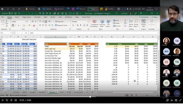
Terra Firma ran a lunchtime brown bag educational session for our consultants to learn about the built-in data management and reporting capabilities of Microsoft Excel and Power BI. Using the strengths of Dynamic Array Formulas and Power Query to dynamically and automatically update outputs in Excel, they also learnt how these skills transfer to unlocking the benefits of Power BI.
One of our in-house data experts took our consultants through the benefits of these readily available tools, giving them a better understanding of ‘what is possible’.
By leveraging the use of Excel Tables to capture data, Dynamic Array formulas can be used to create dynamic and interactive reports. Excel came out with 8 dynamic array formulas in 2018, including SORT and FILTER, and now have many more in the pipeline for future updates of Excel.
Power Query in both Excel and Power BI allows for the connection to data within workbooks, or from multiple outside sources, allowing for automated extraction, merging, appending and transformation. Results can then be linked to table and dashboard reports. Once built, reports can quickly and automatically be updated when new source data becomes available.

Maximising these tools allows organisations to easily and cost effectively build reports and dashboards that:
- Save time by increasing the speed and efficiency of generating meaningful outputs from data.
- Enhance visibility of data results and key performance indicators to organisational stakeholders, by sourcing data from multiple areas and displaying the information as easy-to-understand outputs. This provides key decision-makers with an overview of current KPIs to assess different areas of performance while creating actionable insights.
- Allow for better forecasting. By providing organisations with greater insight into each data set, future demand can be more accurately predicted using historical information. Organisations can effectively plan for demand fluctuations for the next cycle, setting measurable goals and deliverables for greater success.
- Deliver better decision-making. By allowing organisations to analyse key data quickly and meticulously. Visualised interactivity serves to deliver overwhelming amounts of data in a way that is easy to understand. With the ability to easily identify what the data means, better decisions can be made relevant to the organisation. Dashboards give the organisation a single application for connecting to, interacting with, evaluating, and visualising any data, from various sources on any device.


